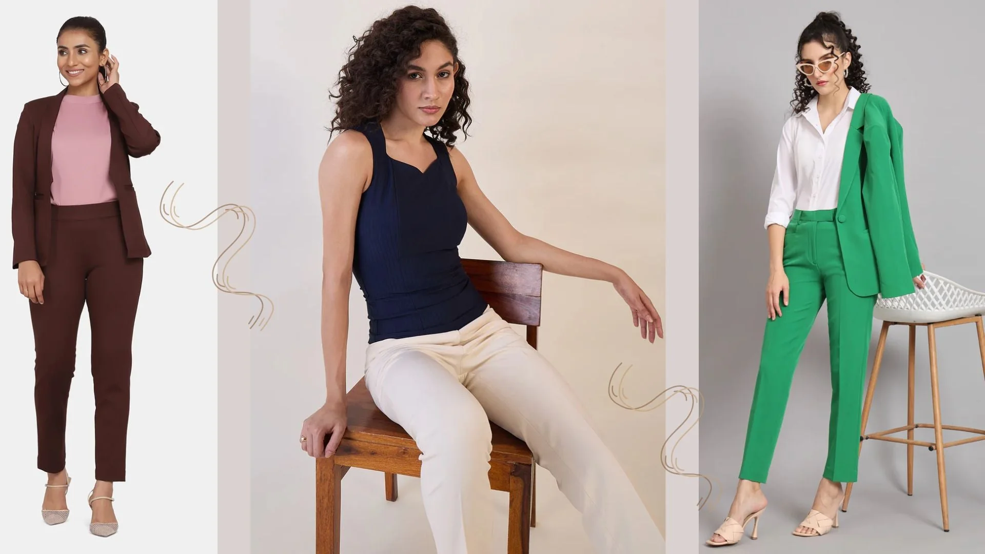
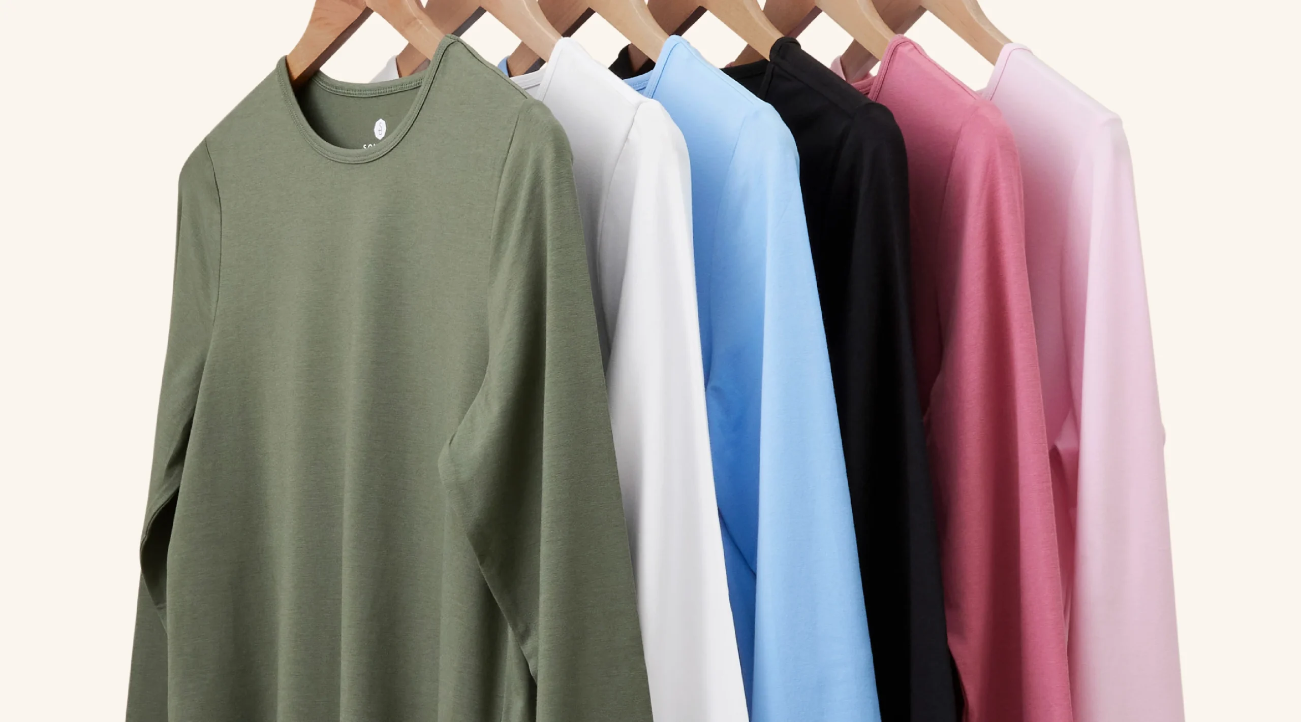
In a world filled with endless possibilities, choosing the perfect color combination can be an overwhelming task. From fashion to home decor, colors have the power to evoke emotions and make a statement. But which 2 color combination reigns supreme? Prepare to embark on a journey through the realm of hues and shades as we explore the contenders vying for the title of the ultimate duo. Get ready to unleash your inner artist and discover which dynamic pair will captivate your senses like no other.
Complementary Colors:
When it comes to color combinations, few are as visually striking and harmonious as complementary colors. Complementary colors are pairs that lie opposite each other on the color wheel, creating a vibrant and balanced contrast. They possess an inherent ability to capture attention and evoke strong emotions in viewers. Think of red and green, blue and orange, or yellow and purple – these pairings create a powerful visual impact that is hard to ignore.
What makes complementary colors so captivating is their ability to enhance each other’s intensity. Placing them side by side creates a heightened sense of contrast, making each color appear more vibrant and dynamic. This phenomenon is known as simultaneous contrast, where the interaction between two opposites intensifies their individual characteristics. It’s like witnessing a beautiful dance between two contrasting personalities – one cannot exist without the other.
Analogous Colors:
Analogous colors are those that are adjacent to each other on the color wheel. They create a harmonious and balanced pairing when used together, making them an excellent choice for creating a soothing and visually pleasing color scheme. One of the main advantages of analogous colors is their ability to create a sense of unity and coherence in design. By using colors that are closely related, you can achieve a seamless transition from one shade to another, adding depth and interest to your composition.
- One approach to using analogous colors is to choose a dominant color in your palette and then use its neighboring hues as accent colors. For example, if you have chosen blue as your dominant color, you can use shades of green or purple as accents to create a visually compelling combination. This technique allows you to maintain balance while still incorporating variety into your design.
- Another benefit of analogous colors is their versatility in evoking different moods and atmospheres. While warm analogous colors such as red, orange, and yellow can bring energy and vibrancy to a space or artwork, cooler analogues like greens and blues can create a calming effect. Choosing the right combination of analogues based on the desired mood will help convey the intended message effectively.
Triadic Colors:
Triadic colors are a dynamic and visually striking choice for creating vibrant and energetic color combinations. Derived from the concept of the color wheel, triadic colors consist of three hues that are evenly spaced from each other, forming an equilateral triangle. Combining these three colors together creates a harmonious blend that commands attention and exudes vitality.
- One of the advantages of using triadic colors is their ability to create balance in a composition. The combination of three distinct hues results in a mutually enhancing effect, where each color amplifies the vibrancy and intensity of its counterparts. This makes triadic combinations particularly useful when you want to draw attention to specific elements or create visual impact.
- Additionally, triadic color schemes offer versatility by allowing you to choose contrasting or complementary hues depending on your desired aesthetic. For instance, selecting primary colors such as red, blue, and yellow can result in bold and eye-catching designs that instantly grab attention. On the other hand, opting for secondary or tertiary shades can produce subtler arrangements while still maintaining an energetic feel.
In conclusion, if you’re looking for a lively and captivating color combination that demands attention, exploring the world of triadic colors may be just what you need. Their harmonious blend ensures visual balance while their innate energy promises an engaging experience for viewers. So why settle for just two colors when you can harness the power of three? Embrace triadic combinations today and let your creativity soar!
Monochromatic Colors:
Monochromatic colors have long been associated with elegance and simplicity, and for good reason. This color scheme, which involves using different shades and tones of a single color, brings a sense of unity and harmony to any design or space. By limiting the palette to one hue, monochromatic colors create a cohesive look that is both visually appealing and calming.
- One of the main advantages of monochromatic colors is their versatility. Whether you’re working with a soft pastel shade or a bold dark tone, the monochrome effect allows you to easily achieve different moods without overwhelming the senses. Additionally, this color scheme can help create depth and dimension in a design by utilizing various tonal variations within the same spectrum.
- Furthermore, embracing monochromatic colors can bring out other elements in your design or decor. By using subtle variations in saturation and brightness within your chosen hue, you can highlight different textures and patterns in your space. This creates visual interest while still maintaining an overall sense of unity. So if you’re looking for an elegant yet simple color combination that effortlessly brings everything together, explore the world of monochromatic colors.
Controversial Combinations:
In the realm of color combinations, there are certain rules that many designers adhere to complementary colors go hand in hand, analogous colors create harmony, and triadic combinations bring balance. But what if we dared to break these conventions and embrace controversial combinations? Sometimes it is precisely these unexpected pairings that can make the biggest impact.
Take the daring combination of orange and pink, for example. These two vibrant hues may not traditionally be seen as harmonious partners, but when used with purpose and confidence, they can create a captivating energy that commands attention. Similarly, mixing black and navy blue might defy conventional wisdom, but this unconventional pairing can result in a strikingly modern and sophisticated look. By venturing into uncharted territory and challenging established norms, we unlock a world of endless possibilities.
Conclusion:
In conclusion, choosing the best color combination for yourself ultimately comes down to personal preference and the effect you want to achieve. While there are no hard and fast rules, there are a few key factors to consider. First, think about the mood or atmosphere you’d like to create in your space. Cool colors like blues and greens tend to evoke a sense of calmness and serenity, while warm colors like reds and oranges can create energy and excitement.
Secondly, take into account the purpose of the space you’re decorating. If it’s a bedroom meant for relaxation, opting for soothing pastel hues might be ideal. On the other hand, if it’s a lively playroom or an energetic workspace, brighter and bolder color combinations could be more appropriate.
Remember that color is subjective – what works for one person may not work for another. The important thing is not to be afraid of experimenting with different combinations until you find one that resonates with your taste and style. So go ahead now, unleash your creativity, mix those pigments together, and watch as your chosen color combination brings life into your surroundings!


